 Our assignment in design class was to create a space- that was eco friendly, in the dimensions of being 20" x 40" and was functional. We were encouraged to design a home, however we could design whatever we chose- as long as we focused on eco friendly building as well as economically friendly features about the house as well. I knew that I wanted to design a residential home, I ended up extending the 20" x 40" dimensions, but Sarah said it was okay- and here is the process of designing my home!
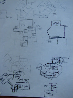
I had trouble on figuring out where to start when designing a home. This way of thinking was something that was totally foreign to me, and I spent a lot of time just struggling to come up with layouts of floor plans. The first image is my first attempts to get the rhythm of floor plans down. I could not visualize how I wanted a 'dream house' or any house i wanted to look like since I usually draw from photographs or real life imagery, so I continued to work with the basis of floorplans in order to visualize my home as a whole.
I wanted to make my home a cabin feel, homey style house that you would find in Colorado. I really wanted the wrap around porch..family feel. I was torn between a country home, a mountain home and the modern feel.
I chose Colorado because I have such a strong connection with the state. My family and I have been takig ski trips and vacations since I was in the second grade and I love Colorado as if it was my hometown! So hence why I have chosen to design a home for Colorado...
 Finally, I got somewhere with the floorplans. Kept drawing random things, and tried to get the shape of the home to start with. I finally decided on an odd shape in order to make it seem more modern, and thus extended walls upward so the house began taking shape!
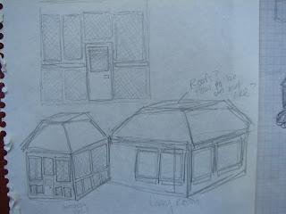
After we had a group critique and I expressed my distressed feelings of confusion on how to design a home...I came up with simpler sketches. I dropped any attatchments I had to designing a home for "me" and I stopped thinking too complexly, and I just drew what I would think of a cabin home in Colorado to appear like... All of the advice from my fellow classmates!
I moved away from the extremely traditional look and found myself focused on the cabin feel with a touch of moderism.
first and second floor blueprint sketches!
Spec Sheet.
Residential Home by Corbie Leiker. Located in Colorado.
Materials: Rammed Earth Insulation, Recylced Wood for internal structure of the home, Recylced Wood for paneling of house.
Special Features: Rammed Earth Insulation Method provides natural insulation in the extremely cold winters in order to reduce the heating bill and naturally cools the home in the summer to reduce the cooling bill and use electricity to heat and cool the home.
Main rooms (such as the living room and the outdoor patio) will be located on the south side thus allowing the house to be lit natually by sunlight and conserving electricity.
Solar Panels: natural energy when electricity is necessary.
 Floorplan: Second Floor. 32' x 24'. Includes: Master Bedroom and Bath, Extra Bedroom, Extra room that could be used as study or another bedroom, floor bathroom, hallway, studi space for artist.
 Floorplan First Floor: 32' x 24'. Includes Kitchen. Living Space, Laundry Room, Garage, Outdoor/Indoor Sitting Area, Bathroom, Closet and Pantry
This is my essay about my eco friendly residential home located in Leadville Colorado. I designed this house to be modern, eco friendly, and to be specific to fitting the needs of an artist who desires to live in Colorado. This spacial and eco friendly home provides enough space for guest, ski gear, artist tools and plenty of family! This home would ideally be up on a mountain hidden within trees; harmonizing it's eco friendly functionality with nature itself. The cabin's exterior includes logs in order to provide a cabin feel to the home. Yet it's recycled materials and many windows provide a modern feel. The interior color pallete includes earthy colors in order to harmonize the modern home with the theme of nature inside and out. The rooms would include colors such as warm creamy browns, soft yellows and deep hues of green. This home will provide an enviromentally freidnly relaxing enviroment that any artist would be able to live in and create artwork for a lifetime!
Final Design made on Sketch up!
I'm programmed challenged so this was an accomplishment!


.jpg)

